If you haven’t been keeping up, my brother Dan and our buddy, his volleyball teammate, Steve commissioned me to doodle up something for their V-Ball team’s t-shirt. The team name? “Makin’ Bacon Naked.” I took the challenge (you can see the earlier stages of the process here and here) and it’s been a blast so far. Now, let’s delve into part three of the process.
Dan, Steve and (at first reluctantly) I decided that my hand drawn text just wasn’t quite working for the t-shirt, so I mocked up a huge series of text treatments with different fonts for them to see and choose from. Here, I’ve posted all my initial attempts, some brief commentary on them and the near-final designs these have resulted in.
Here we go!
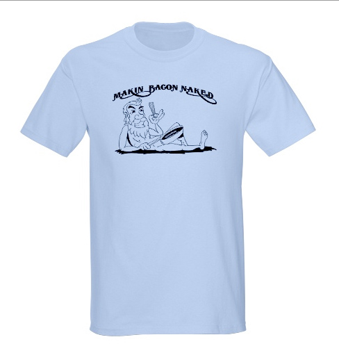
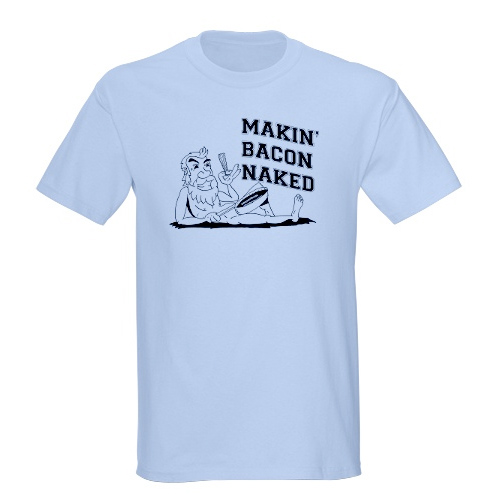
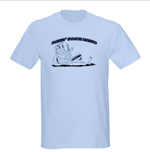
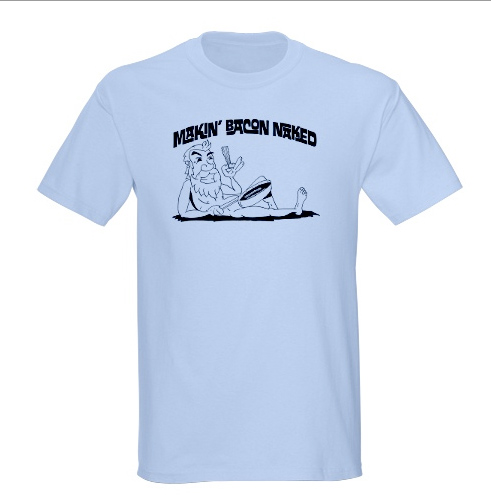
I sent the initial designs to Dan and Steve, which led to Dan expressing a desire to have the font look like the text on a trippy, old ’60s music poster. Dan sent me a Jefferson Airplane poster to work from and here is what I came up with.

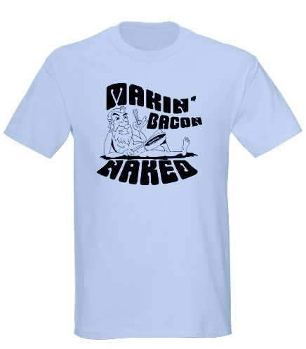
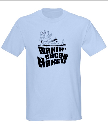
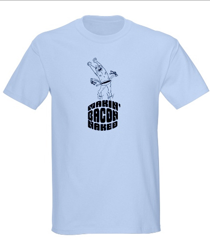
Steve really liked the “Jump For Joy/Bacon” character I drew and wanted to see him with some text treatment added. The Cafe Press example I worked up made him a little too small, but it still looks kind of cool.
Dan liked the Fillmore font, but wanted to see what it would look like with the reclined Enemy of Peanuts on top of some of that sexy ’60s font and squishing it down. So, I gave that a shot.
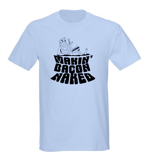
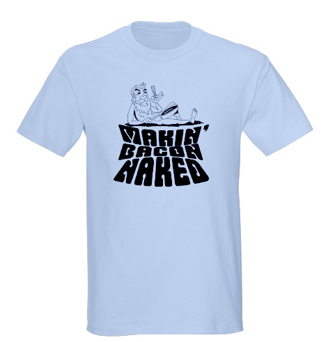
After all these designs, Dan and Steve took them to the team and got some feedback. These next designs are what I made up most recently as potential final designs. They are a bit simpler, but I rather like them.
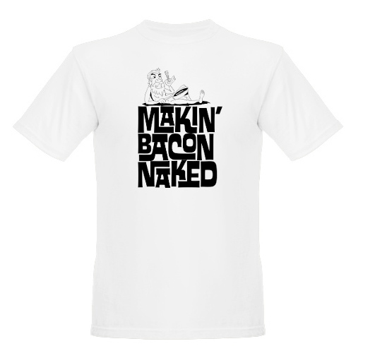
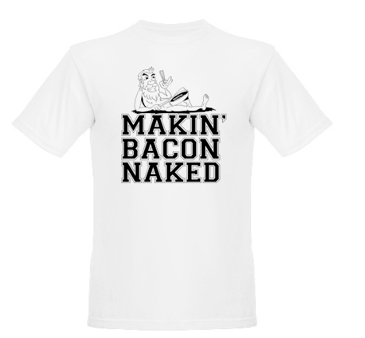
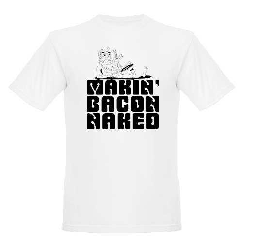
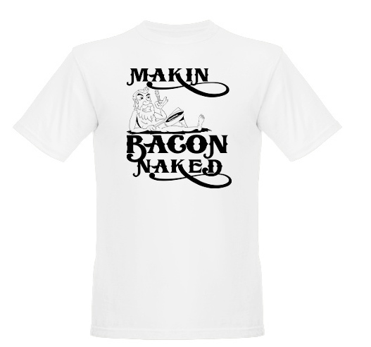
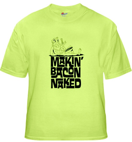
At this point, I am just awaiting final reactions and then they’ll be making up the t-shirts. I’ll make sure to post some pics of the final product.
Also, all this t-shirt work has left me with a serious desire to work up an official Enemy of Peanuts t-shirt. So, stay tuned for potential purchasing of that when i get it done, not to mention a possible chance to get your own Makin’ Bacon Naked shirt! Bitchin’, right? Yeah, stay tuned! FER REALZ!

Man! Those look pretty good. Nice design work. I like the one that buttons like a diaper– LOL… You should do more shirts– like with jokes and stuff like that; people love that stuff… good drawing!